The plan, five faces
Five ways to make 🗺 MY PLAN force the next thing on the player · round 1 · 2026-09-23 · four real plans, no spendThe ask, and what the screen does today
Lionel: "the AI practice plan functionality is a bit hard to understand. I think it has something to do with the GUI. I think we need a more video game esque style where everything is kind of forced to you, and you don't have to click around too much to understand what's going on."
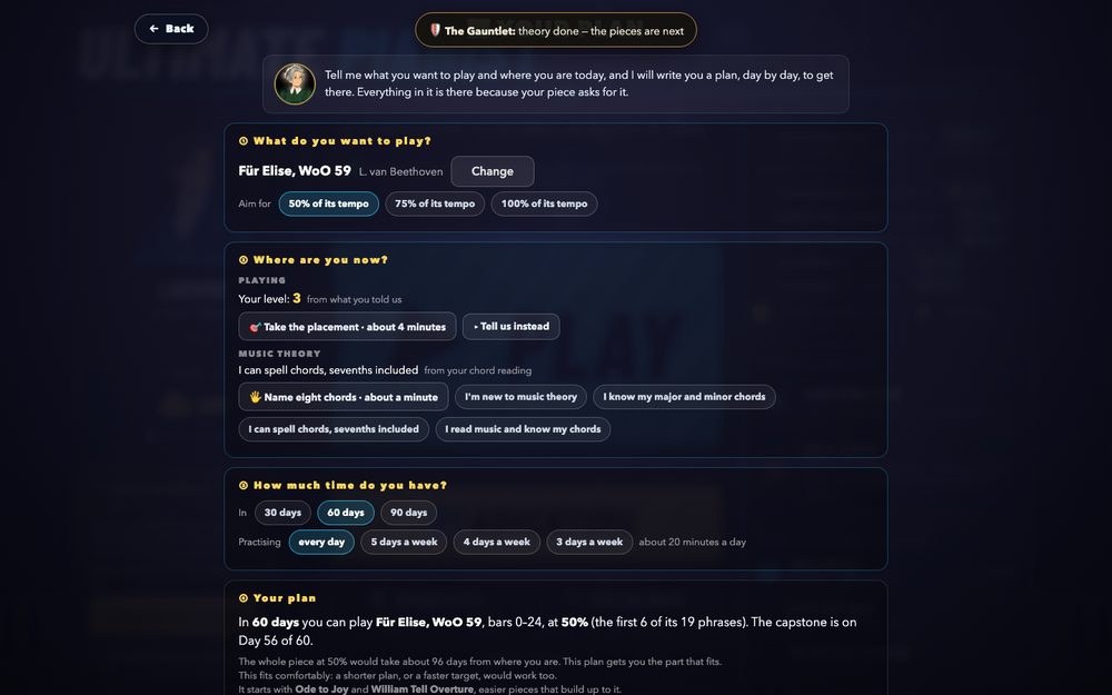
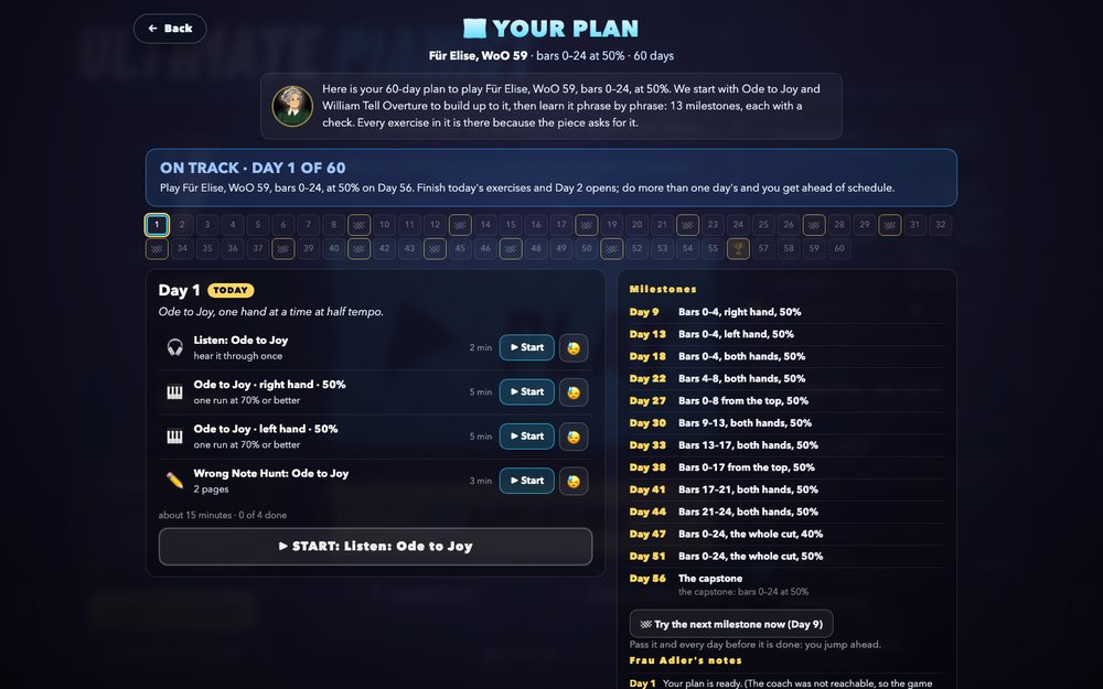
The screen that shipped on 2026-09-18 is a dashboard. It is correct, and it asks the player to read it: a banner, a strip of sixty cells, today's cards with two buttons each, a table of thirteen milestones and a log, all at once, every visit. The builder before it is a form.
The rules every face obeys
- One lit thing. At any moment exactly one control glows, and Enter presses it. A player's hands are on the keys.
- The next thing is chosen for you. The exercises of a day come in their order; there is no choosing among them. Leaving is always allowed (a tiny "stop for today") and never suggested first.
- The structure is felt, not read. Milestones are flags, gates, gold cards or chapters; "ahead" is a place or a sentence, never a table.
- The whole plan is a page you open on purpose (📖, the journal: the shipped screen, demoted), never the screen you land on.
- The builder asks two things: the piece, and where you are. Sixty days, every day, twenty minutes is the default; changing it is a small link, not a row of chips.
Try them. Each face below is live: press the buttons in the frame, or drive it from the side (pass, miss, too hard, finish the day, three days in one sitting, a day with no practice, a milestone early). Enter works when a frame has focus. 🖥 / 📱 switches the frame.
What is real: the four plans are plan-core.buildTimetable over the Learning Plan Lab's snapshot (a Twinkle player, level 3, 60 days), and every event runs plan-core itself: recordRun, dayComplete, standing, struggle (the split), moveCheck, passAhead. What is faked: the run (a bar and a chosen accuracy), the placement (always level 3), the coach's words (the game's own defaultWords stand in for Gemini's), and the results screen's score in E. Nothing here touches the game or the network.
The Road
also: The Saga MapThe plan is a road drawn on the ground: sixty stops, a flag at every milestone, the castle at the end. One stop glows, your pianist stands on it, and the only button is the next exercise. The camera follows you; the road you have walked turns green behind you.
The first minute
Choose a destination from four. Play the placement ("the road starts where you stop"), and the road draws itself from your level to the castle on Day 56. You are standing on Day 1 with one button: ▶ Play: Listen to Ode to Joy.
How it forces the next thing
The callout under your stop names one exercise. When it ends, the result appears in the same callout with ▶ Next. The day's exercises are pips in the callout; you never choose among them. Finish the day and the stop bursts, the road ahead lights, the camera pans to the next stop.
What it hides, and where
The milestone table (the flags say where they are; hover one for its name), the notes, and the choice of order. All three are in 📖. The buffer after the castle is the dashed tail of the road.
Build
M. An SVG road, a camera and the callout. The day panel's logic, the results strip, the launchers and the surgery are reused unchanged; the road is a new face on the same plan object.
Pros
- The most "video game" of the five and instantly legible: progress is distance.
- Milestones and the capstone are visible from anywhere on the road, without a table.
- Vertical, so a phone scrolls it naturally.
- The stop bursting and the camera panning make "day complete" an event, not a banner.
Cons
- Sixty stops of the same shape; it needs a painted map to delight rather than chart.
- On a small phone the callout covers the road it is explaining.
- "Ahead" is still a pill; the road shows what is done, not what the calendar expected.
One Card
also: The ConveyorThe day is dealt one card at a time. A card is one exercise, large: what, why, how much, and one button. When it ends, the card turns over to show the result and the next card slides in. There is no plan screen; the whole plan is a page behind a small 🗺.
The first minute
Three full-screen questions: what do you want to play; show me where you are (the placement); Frau Adler's one-paragraph offer. Then the first card, Listen to Ode to Joy, with ▶ Play. Nothing else on the screen.
How it forces the next thing
The screen only ever holds the current card, its result, or the day-complete card. Enter plays it. "then: …" at the foot says what comes next; the segments at the top say how far into today you are. Day complete is a green card with the ahead count and ▶ Start Day 5, with a tiny "that's enough for today".
What it hides, and where
Everything: the strip, the milestones, the notes (🗺 opens the shipped screen as a journal). A milestone is a gold card when it comes, with its number.
Build
S. The current day panel, one row at a time, made large; the results strip's NEXT becomes the back of the card; the journal is the current screen kept as it is. The smallest build in the round.
Pros
- The purest answer to "don't click around": there is nothing to click around.
- Identical on a phone; the card is already a phone layout.
- The "why" line finally has room to be read, so every exercise explains itself.
- Smallest build; nothing under it changes.
Cons
- Claustrophobic for the player who wants to see the week; 🗺 must be discoverable.
- Structure is felt only on the gold check card and the day-complete card.
- Sixty days of the same card is a treadmill unless the coach's daily line varies it.
- The least "game" of the five: it is a lesson app's screen.
The Coach
also: The LessonFrau Adler is on screen and speaks. Every beat of the plan is a line of dialogue: the day, the exercise and why, the result, the milestone, the celebration. You answer with one of two buttons. The structure is never shown; it is told.
The first minute
"What would you like to play?", four names. "Let me hear how you play." ▶ Play them. "You stopped at the third phrase, about Twinkle. Sixty days gets you bars 0–24 at half speed. Shall I write it?" ✨ Write it. "Day 1. Ode to Joy, one hand at a time. First: listen. Ready?"
How it forces the next thing
One sentence, one primary button, one alternative (😓). The result is her reaction and the next thing in the same breath: "92%. Sehr gut. Next: …". A milestone is a title card over her head. Ahead or behind is what she says at the end of the day, and a pill in the corner.
What it hides, and where
All of it; 📖 in the corner opens the list beside her. The split ("only the first three notes today, the thumb crossing tomorrow, again on Day 7") is spoken, which is the most natural place it has been.
Build
M. A dialogue composer (this lab's coachLine is the skeleton) and the box; a portrait set with two or three expressions. Optionally a coach call per day for varied lines, which is a cost per player per day where the shipped plan makes one call per plan.
Pros
- The warmest, and it is the "AI coach" the feature is sold as, made visible.
- The reshuffle finally sounds like a teacher, not a log line.
- Every line can be Gemini-worded, as the intro already is.
- Phone-native: a portrait and a box.
Cons
- The slowest: a sentence to read at every beat; by Day 30 the typewriter is a wall to click through.
- Reading to find out what to do is the opposite of a glance.
- A script repeats ("Sehr gut" two hundred times) unless it is varied, which costs.
- Needs portrait art to carry it.
The Tower
also: The ClimbDays are the floors of a tower and you climb one a day. A floor's exercises are its doors, left to right; a milestone is a gate; the capstone is the crown. Today's date is a dashed line across the tower: stand above it and you are ahead, below it and you are behind. Your standing is a picture.
The first minute
Choose the crown, climb the placement stairs (the step you stop on is the ground floor), enter. You are on floor 1 with one lit door.
How it forces the next thing
The lit door is the next exercise and the one button under the tower opens it. A result opens the door ("✅ the door opens") and lights the next. Clear a floor and the sprite climbs. A gate that holds (a failed check) offers "come back in two days", which is moveCheck.
What it hides, and where
The list (📖). The floors below you are the strip, greened; the floors above are locked; the gates are the milestone table, drawn.
Build
M–L. The tower layout, a camera, doors with labels, the date line, a climbing sprite. The largest build of the five; the doors and gates are the same cards and checks.
Pros
- The only face where "3 days ahead" needs no words: your feet are above the date line.
- Milestones are gates you can see coming from floors away.
- Fits the game's own idioms: Gauntlet levels, the saloon ladder, a climb.
- Vertical, so a phone is natural; the current floor is a full-width panel.
Cons
- The biggest build, and a sprite that must climb convincingly.
- Sixty floors of the same band read as a spreadsheet turned sideways unless the art carries it.
- The metaphor strains after the crown (the buffer floors above the top).
The Quest
also: The TrackerThere is no plan screen. The plan is a quest in the corner of the menu: today's objectives with one lit, the chapter you are in (the next milestone) and how far along, and the PLAY door itself reads ▶ CONTINUE with the next exercise. Every results screen docks the same tracker with ▶ Continue. The full plan is a journal.
The first minute
A scroll unrolls on the menu: NEW QUEST, learn a piece in 60 days; pick one. The tracker appears with Objective 1, the placement, and the PLAY door says so. After it, Frau Adler writes the quest and the door reads ▶ Continue: Listen to Ode to Joy.
How it forces the next thing
The biggest button on the menu is the next exercise while today is open; the tracker's lit objective and the door say the same thing. After a run the tracker on the results screen says ✅ and lights the next; Enter continues. When the day is done the door goes back to PLAY and the tracker says "Day 5 opens tomorrow · or start it now": forced while there is something to do, quiet when there is not.
What it hides, and where
The plan screen entirely; 📖 Journal is the shipped screen. The milestone table becomes chapters with a progress bar.
Build
S–M. One tracker component in two places (the menu, the results panel), the door's text, the journal. The results strip that exists today is two-thirds of it.
Pros
- The smallest disruption: the menu stays the menu, and the plan follows the player instead of being a place.
- The RPG quest log is the most widely understood idiom in games.
- The results screen already carries the strip; this makes it the same component everywhere.
- "▶ Continue: the next exercise" on the PLAY door is worth doing in any version.
Cons
- The weakest at explaining the whole: a tracker is a corner, and a first-day player may not see a plan at all.
- Depends on the menu, which is itself in flux (the Stage menu A/B, the one-room lock).
- The results screen is crowded already (score, luck roll, achievement toast); a docked panel competes.
Side by side
| A · The Road | B · One Card | C · The Coach | D · The Tower | E · The Quest | |
|---|---|---|---|---|---|
| The picture | a road with sixty stops | one card | a person talking | a tower of floors | a quest log on the menu |
| What you see on Day 4 | your stop lit, one button | the second card of four, one button | "Next: … Go" | floor 4, four doors, one lit | the menu; the door reads Continue |
| Where "3 days ahead" shows | the pill; the green road behind you | the pill; the day-complete card | she says it; the pill | your feet above the date line | the pill in the tracker |
| Milestones | flags on the road | a gold card when it comes | a title card | gates | chapters with a bar |
| The results moment | the callout on the road | the card turns over | her reaction | the door opens | the tracker on the results screen |
| The builder | destination → placement → set off | three full-screen questions | a conversation | the crown → the stairs | a quest scroll on the menu |
| On a phone | a vertical road; the callout covers it | identical | identical | a vertical tower | the tracker above the door |
| Build | M | S | M | M–L | S–M |
| The risk | needs map art to delight | claustrophobic; the least game-like | slow and wordy by Day 30 | heavy; spreadsheet sideways | invisible to a first-day player |
Recommendation
B, One Card, with A's road as the day-complete screen, and E's door on the menu in any case. B removes the problem rather than restyling it: there is one thing on the screen, it is the next exercise, Enter plays it, and the card has room to say why. It is the smallest build (the shipped day panel dealt one row at a time, with the results strip's NEXT as the card's back) and it is the same on a phone. Its one weakness, that the shape of the whole is felt only at the end of a day, is exactly what A's road is good at: show the road once a day, on the day-complete card, with the stop bursting and the flags ahead, and the player gets the game feel Lionel asked for without living in a map. E's door text ("▶ Continue: the next exercise" on the PLAY door while today is open) is a two-line change that makes the plan the biggest button in the game, and belongs in every version.
Runner-up: A on its own, if the game feel should be in every screen and there is art budget for a painted road. D's date line is the best single idea in the round (ahead and behind as a place, not a number) and could ride on A's road as a marker. C should not be the screen; its dialogue composer should word B's cards and the day-complete line, which is where a teacher's voice earns its length.
Verdicts go in the Design Gallery round: ★ picked is the build order; ❤ and 👍 are notes.